Why the nerves? Well, given the names of my fellow artists, I concluded early on that it was a foregone conclusion that I'd be bringing up the rear quality-wise. Seriously. Let's take a look at the names of the other artists, shall we?
Tran Nguyen
Nicolas Delort
Robert Hunt
Eric Fortune
Iain McCaig
Karla Ortiz
Greg Manchess
So, yeah. How am I supposed to live up to that? I couldn't. But I did have an idea.
One word: volume.
I decided that instead of doing one piece, I'd do three. The way I saw it, doing more than one relieved me of the pressure of doing that one, amazing piece that would blow everyone away while simultaneously curing world hunger, revealing all of the mysteries of the universe, and finally getting people to like me. By doing three, I could spread out such responsibility and decrease my risk of feeling like an utter failure while dramatically increasing the chances that at least one of the resulting images would be worth a damn. So I set to work.
As far as constraints go, there are virtually none with MicroVisions. There's no theme, no art direction. The pieces produced just need to be 5 inches by 7 inches. Vertical or horizontal. Given that I've of late been trying to keep some small pieces going at all times for experimentation purposes, I had a lot of spare boards laying around the studio.
The first I produced was a bit odd for me. A fairly confined value structure with a limited palette of leftover paint from a previous project. It was a pretty quick one that basically resulted from making marks on the board with paint, then wiping periodically until I saw something to build on. No preconceived notions, no photo reference. Just a bit of cloud-seeing and some crossed fingers.
Here's the piece that resulted:

It's an oddly muddy painting and is one of the most difficult pieces I've ever tried to digitally color-correct. I'm pretty sure this still doesn't do it a whole lot of justice, but the image above is as close as I've been able to get it.
If you're a curious art nerd like myself, the colors on the palette included Ultramarine Blue, Cadmium Yellow, Magenta, Flesh Tone (Windsor & Newton), and Titanium White. As it got close to completion I might have added to this list, but I don't recall whether that ended up being the case. I started the second and third pieces just before finishing this one and I did make an honest attempt at keeping the palettes separate.
Anyway, after I'd completed all three paintings, I showed them to the folks organizing the show and offered up whichever they wanted. Any reading this who've seen posts about MicroVisions on Facebook already know that this wasn't it, and I'm totally cool with that. But I'm not unhappy with the piece. It was a fun little exercise and I rather like the limited color and value.
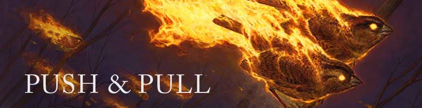
Next week, I'll show you another piece done for the show and will follow that up with the third to coincide with the opening of the auction. As of this writing (May 6, 2014), the pieces are hanging at the Society of Illustrators in New York City and will remain so through the 24th of May. If you have a chance, go have a look.
How are you supposed to live up to that? you sir, are very humble :)
ReplyDelete